Argon的下载
此主题并不可以在官网的安装主题中找到,需要自己去Agron的github上进行下载,下载完成后进行如下操作:进入后台 – 外观 – 主题 – 安装主题 – 上传主题 -选择下载的zip文件。
若出现“上传的文件大小超过 php.ini 文件中定义的 upload_max_filesize 值” 网络上有许多教程,读者可自行解决。
Argon的美化
Argon的主题设置
进入后台 – Argon主题设置 ,自行设置即可,也可以自行导入其他人的设置。
tips:很多Argon美化的blog会选择禁止主题更新,读者自选即可。
年度倒计时显示 (左侧栏)
效果如右图所示→
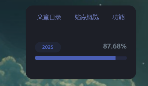
操作示例:进入后台 – 外观 – 小工具,在左侧栏小工具添加简码, 粘贴代码。
<div class="progress-wrapper" style="padding: 0">
<div class="progress-info">
<div class="progress-label">
<span id="yearprogress_yearname"></span>
</div>
<div id="yearprogress_text_container" class="progress-percentage">
<span id="yearprogress_progresstext"></span>
<span id="yearprogress_progresstext_full"></span>
</div>
</div>
<div class="progress">
<div id="yearprogress_progressbar" class="progress-bar bg-primary"></div>
</div>
</div>
<script no-pjax="">
function yearprogress_refresh() {
let year = new Date().getFullYear();
$("#yearprogress_yearname").text(year);
let from = new Date(year, 0, 1, 0, 0, 0);
let to = new Date(year, 11, 31, 23, 59, 59);
let now = new Date();
let progress = (((now - from) / (to - from + 1)) * 100).toFixed(7);
let progressshort = (((now - from) / (to - from + 1)) * 100).toFixed(2);
$("#yearprogress_progresstext").text(progressshort + "%");
$("#yearprogress_progresstext_full").text(progress + "%");
$("#yearprogress_progressbar").css("width", progress + "%");
}
yearprogress_refresh();
if (typeof yearProgressIntervalHasSet == "undefined") {
var yearProgressIntervalHasSet = true;
setInterval(function () {
yearprogress_refresh();
}, 500);
}
</script>
<style>
#yearprogress_text_container {
width: 100%;
height: 22px;
overflow: hidden;
user-select: none;
}
#yearprogress_text_container > span {
transition: all 0.3s ease;
display: block;
}
#yearprogress_text_container:hover > span {
transform: translateY(-45px);
}
</style>
菜单前添加图标
注意这里面的图标其实本质上是文字而不是图片。
Argon 主题内置了 Font Awesome 4.7.0 图标库。所以只需要在前面添加代码即可。
图标库链接:Font Awesome Icons
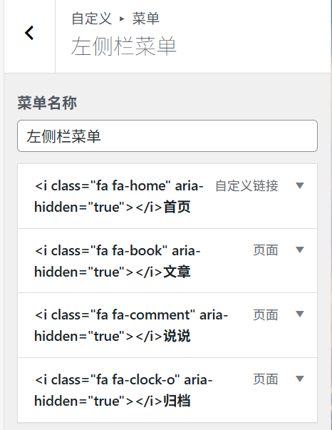
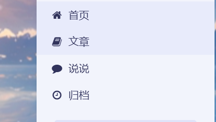
操作示例:进入后台 – 外观 – 自定义 – 菜单 – 左侧菜单
输入在Font Awesome 4.7.0找到的代码。(读者也可以据此操作在顶部导航栏等处添加图标)
效果如图一所示(输入后),效果为图二。
这里给出示例所用的代码:
<i class="fa fa-home" aria-hidden="true"></i><i class="fa fa-book" aria-hidden="true"></i><i class="fa fa-comment" aria-hidden="true"></i>
<i class="fa fa-clock-o" aria-hidden="true"></i>
Github卡片
效果如右图→
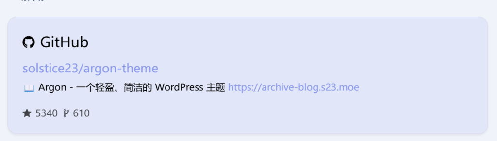
操作示例:进入后台 – 外观 – 自定义 – 额外CSS
在额外CSS中添加:
/* Github卡片样式*/.github-info-card-header a {    /*Github卡片抬头颜色*/    color: black !important;    font-size: 1.5rem;}html.darkmode .github-info-card-header a {    /*Github卡片抬头颜色——夜间*/    color: #FAAB78 !important;    font-size: 1.5rem;}.github-info-card {    /*Github卡片文字(非链接)*/    font-size: 1rem;    color: black !important;}html.darkmode .github-info-card {    /*Github卡片文字(非链接)——夜间*/    font-size: 1rem;    color: #FAAB78 !important;}.github-info-card.github-info-card-full.card.shadow-sm {    /*Github卡片背景色*/    background-color: rgba(var(--themecolor-rgbstr), 0.1) !important;}
/* Github卡片样式*/
.github-info-card-header a {
    /*Github卡片抬头颜色*/
    color: black !important;
    font-size: 1.5rem;
}
html.darkmode .github-info-card-header a {
    /*Github卡片抬头颜色——夜间*/
    color: #FAAB78 !important;
    font-size: 1.5rem;
}
.github-info-card {
    /*Github卡片文字(非链接)*/
    font-size: 1rem;
    color: black !important;
}
html.darkmode .github-info-card {
    /*Github卡片文字(非链接)——夜间*/
    font-size: 1rem;
    color: #FAAB78 !important;
}
.github-info-card.github-info-card-full.card.shadow-sm {
    /*Github卡片背景色*/
    background-color: rgba(var(--themecolor-rgbstr), 0.1) !important;
}
悼念色
遇到国家重要人物逝世等重大时点,为了表示悲悼,很多网站会选择全黑白的配色。
下图为效果
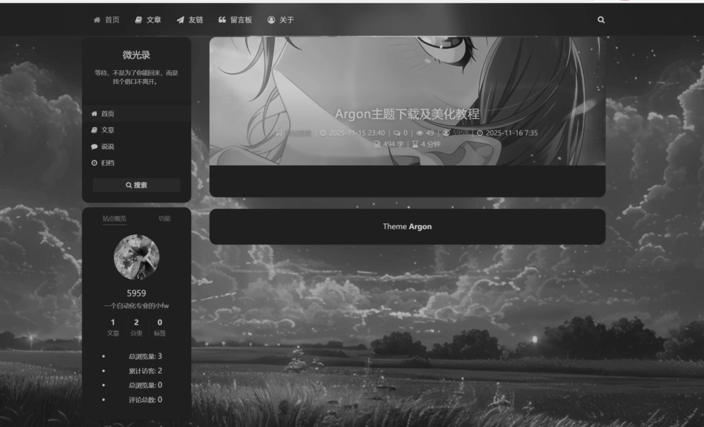
操作示例:打开后台 – 外观 – 自定义,在额外CSS的最底部(否则容易和其它CSS代码冲突)添加下列代码即可:
/*网站黑白色(悼念)*/
html {
    filter: grayscale(100%);
    -webkit-filter: grayscale(100%);
    -moz-filter: grayscale(100%);
    -ms-filter: grayscale(100%);
    -o-filter: grayscale(100%);
    filter: url("data:image/svg+xml;utf8,#grayscale");
    filter:progid:DXImageTransform.Microsoft.BasicImage(grayscale=1);
    -webkit-filter: grayscale(1);
}
参考
Echo:Argon主题博客美化
Bensz:Docker系列 WordPress系列 特效 – Bensz
鸦鸦的巢穴:Argon 主题修改记录
Impressi0n:Argon美化教程(搬运+实践)
other
附灯宝美图QAQ